
When it comes to communicate personalized study results by region or market segment to a large number of stakeholders, automating the production of study reports becomes a powerful lever for productivity and data valorization.
1. Context: why and when to automate study report production?
Producing study reports is a key step in data valorization. However, manually creating these documents is often labor-intensive, error-prone, and time-consuming. Automating their production enables faster and more reliable delivery, freeing analysts to focus on analysis and decision-making.
Automation is particularly necessary:
- When you have to manage large volumes of indicators and pages (for example, more than 1200 indicators measured with numerous photos as in ValueAble’s Perceived Quality study);
- For short reports with a high production frequency (weekly, monthly or quarterly), intended to be communicated to hundreds or thousands of recipients.
2. The process of producing an automated study report
This process always follows the same fundamental steps:
✓ Data Analysis: After collection and processing the data, results are analyzed against set objectives to extract key results.
✓ Report Template Creation: A “prototype” report is designed to showcase these results in a clear, accessible manner to ensure comprehension by the end readers.
✓ Structural Analysis of the Report: Identification of all dynamically updateable elements (texts, tables, charts, fonts, and other various objects).
✓ Template Preparation: This preparatory step makes the template compatible with automation (format, dynamic zones, styles, etc.).
✓ Results File Preparation: Specific formatting of input data so that they can be easily read by the automation program.
✓ Automated Report Generation Program Development: Scripting to generate reports (PowerPoint, PDF, Excel) via scripts, macros or specialized software.
✓ Final Validation: Verification of data accuracy, compliance with client requirements, and visual quality.
At Stat & More, our expertise is based on a deep understanding of our customers’ specific expectations combined with advanced statistical, data analysis and autoùation scripting skills. This combined know-how, along with rigorous mastery of programming tools, enables us to precisely script and deliver the expected analyses.
This methodical approach allows us to efficiently automate complex statistical treatments, such as Llosa matrices, driver analyses, advanced mappings, and causal analyses… while ensuring perfect alignment with client specifications.
3. Client benefits of automation
3.1 A Large report BUT rarely edited
Consider the example of Vehicle Perceived Quality studies with more than 1200 indicators and several thousand photos to integrate. Automating large reports like this allows:
- Ensuring data integrity despite the large volume of information processed,
- Drastically reducing production time and controlling editing costs,
- Enabling rapid updates when new or corrected data are available,
- Minimizing human errors linked to handling large volumes.
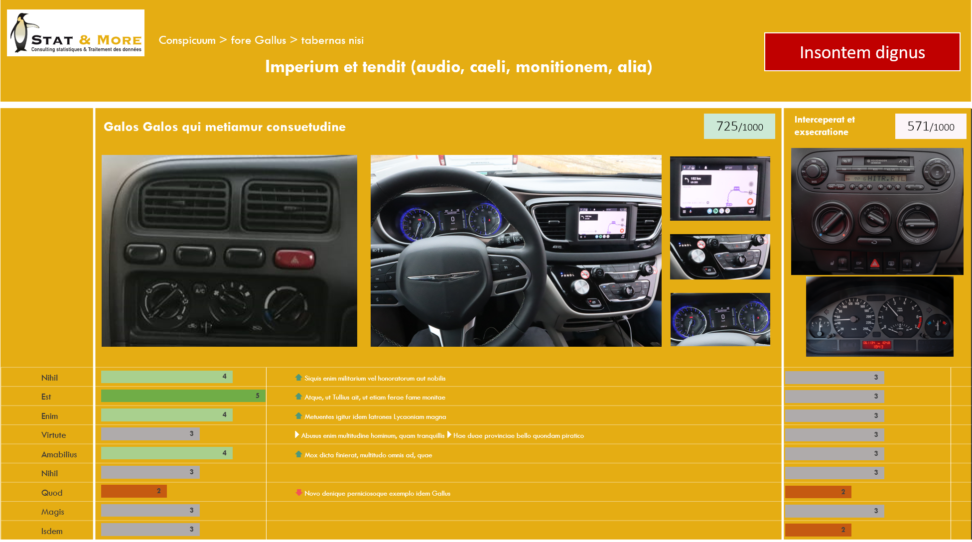
Source Images : https://commons.wikimedia.org
3.2 A personalized, concise report by geographic area or market segment AND / OR high frequency of production
In this case, a shorter report (15 to 50 pages) is regularly generated — for example weekly or monthly — and must be produced at scale for hundreds or thousands of recipients (branches, agencies, subsidiaries). The benefits include:
- Rapid and scalable production, adapted to expected deadlines,
- Graphic and editorial consistency is ensured even with large volumes of reports whose content may differ, such as different languages or varying levels of detail depending on the reader’s access rights to information
- Flexibility in customizing reports to the target audience, including language versions with Asian or Cyrillic alphabets,
- Significant productivity gains strengthen the ability to manage end clients and respond quickly based on the communicated results, allowing them to draft and implement their own action plans rapidly after reading the delivered report.
4. The importance of data visualization in report template creation
Data visualization is not mere graphic decoration but a fundamental tool to transform data into clear, engaging, and actionable stories.
Inspired by the work of Cole Nussbaumer Knaflic in Storytelling with Data, we apply rigorous principles to design report templates that facilitate not only result comprehension but also decision-making.
4.1 Why is data visualization crucial?
Data visualization addresses a major challenge: how to make complex numeric information accessible and memorable? Studies [1,2,3] show that well-designed visuals improve understanding, accelerate decision-making, and facilitate detecting trends and anomalies.
Instead of overwhelming readers with tables of numbers, visualization transforms raw data into clear and precise visual messages.
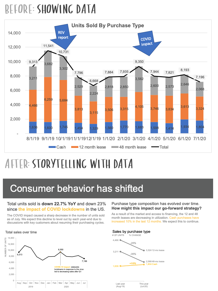
Source Images : https://www.storytellingwithdata.com/makeovers
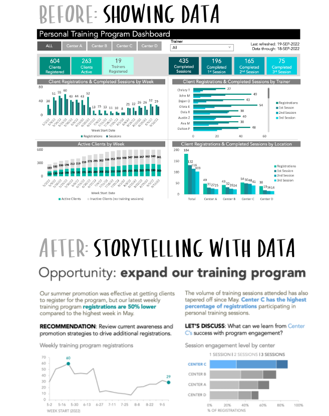
Source Images : https://www.storytellingwithdata.com/makeovers
4.2 Key principles we follow
According to Cole Nussbaumer Knaflic, storytelling with data rests on essential pillars that we systematically integrate into our templates:
✓ Simplicity and Clarity: Removing any unnecessary element so that only the key message remains visible.
✓ Clear Context: Each chart must be unambiguously understood, with explicit legend and descriptive title.
✓ Visual Hierarchy: Using colors, sizes, and shapes to prioritize information and draw attention to what matters.
✓ Narration: Building a logical sequence where each chart supports an idea, creating an understandable storyline.
✓ Audience Adaptation: Choosing visualization formats suitable for the readers’ profiles, whether expert or not.
4.3 Data Visualization: Driving Result Appropriation
By adhering to these principles, we promote quick and lasting appropriation of results by readers: both decision-makers and operational staff can grasp key insights at a glance, facilitating dialogue and action.
This importance of data visualization is concretely reflected in our templates through the careful integration of interactive charts (Excel), clear infographics, and concise dashboards always aligned with report communication goals and client requirements.
CONCLUSION
Automating study reports is a true revolution in how data are valorized and communicated. At Stat & More, our combined technical and statistical expertise supports clients in pursuing efficiency, reliability, and quality in their analysis and results communication services.
The complementary contribution of data visualization skills ensures readers receive reports that are both impactful in content and accessible in form.
Our deliverables, produced natively in Microsoft Office formats or as custom web dashboards (Python, Apache Superset), are crafted with a high standard of quality. This technical expertise and attention to presentation truly simplify the work of readers: they can rely on clear and intuitive materials that accelerate decision-making and the drafting of effective action plans, helping them achieve their objectives more efficiently.
REFERENCES:
✔ [1] https://www.insee.fr/fr/information/7722079?sommaire=7722116
✔ [2] https://blog.ism.fr/comprendre-les-donnees-sans-effort-grace-a-la-dataviz/
✔ [3] https://academy.visiplus.com/blog/analytics-2/la-dataviz-pour-mieux-comprendre-les-donnees-et-raconter-des-histoires-inspirantes-2018-08-13
✔ https://www.storytellingwithdata.com
✔ https://www.youtube.com/watch?v=i0W-DvgRvos
✔ https://www.data-bird.co/blog/data-visualisation
✔ https://www.narratiiv.school/actualites/communication/data-visualisation
✔ https://www.mprez.fr/blog/limpact-de-la-data-visualisation-dans-la-prise-de-decision-strategique
✔ https://www.oracle.com/fr/database/data-visualization-definition/
✔ https://www.sas.com/fr_fr/insights/big-data/data-visualization.html
✔ https://intelligence-artificielle.com/dataviz-guide-complet/
✔ https://www.intotheminds.com/blog/data-visualisation/
✔ https://fr.wikipedia.org/wiki/Visualisation_de_donn%C3%A9es